|
In this assignment, we added on to our previous Links Webpages and applied our new knowledge on how to add images. We had to create one original image and have two other images added on to our Links Webpage. You can see my website on Neocities.  
0 Comments
In this lesson, we learned how to make hyperlinks in our webpage in Neocities. I linked my favorite websites as well as my previous webpages.   In this lesson we learned how to make ordered and unordered list. Ordered List would come out as numbers and unordered lists would come out as bullet points. I found this process tedious as I had to keep writing ingredients/instructions every new line. I made this site using Neocities. 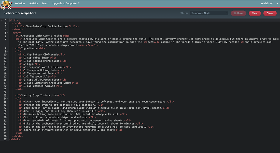 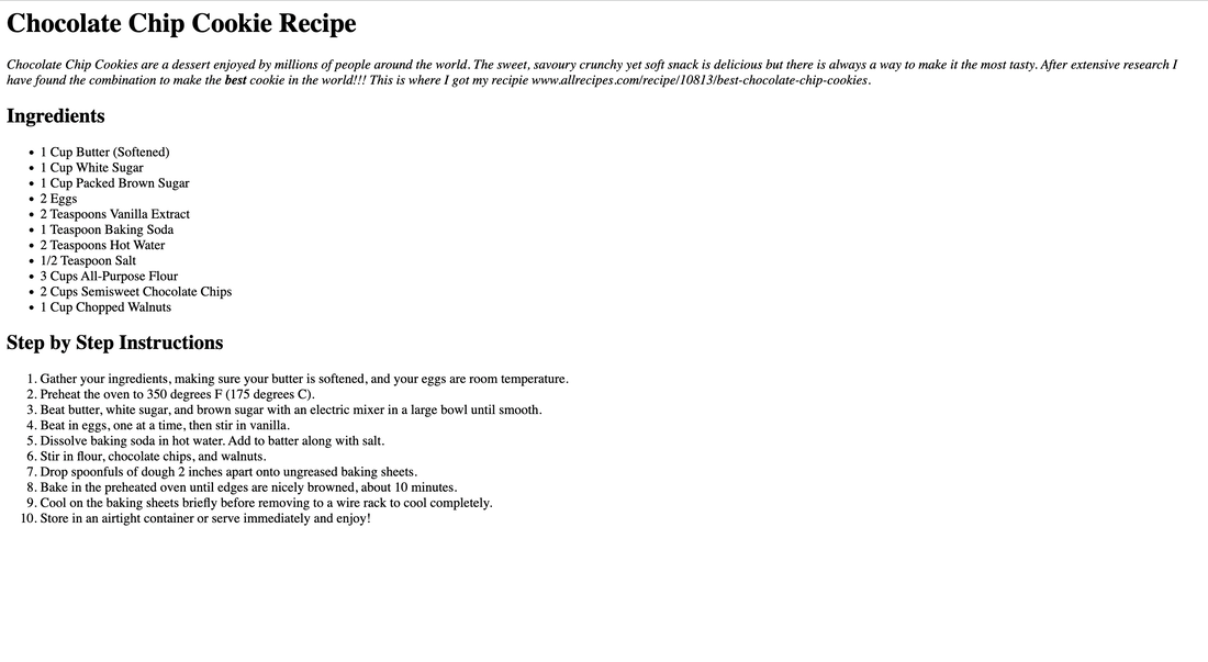 In this lesson I learned how to make line breaks and horizontal breaks to create spaces in the website. I also learned how to make words bold or italic in order to make them stand out. I used Neocities to make this website and you can see it here. 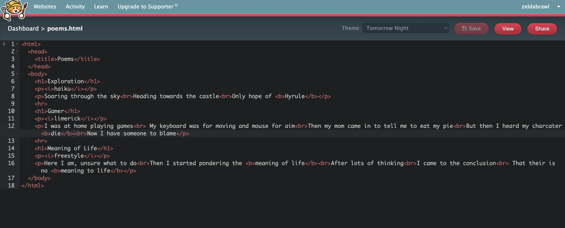 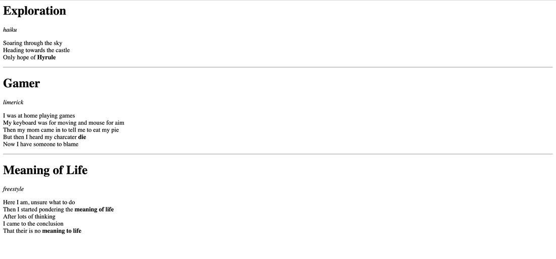 For this assignment we were asked to make a website using only code. It was quite easy as we did it step by step without rushing. This was all possible thanks to Neocities and you can see my website here. 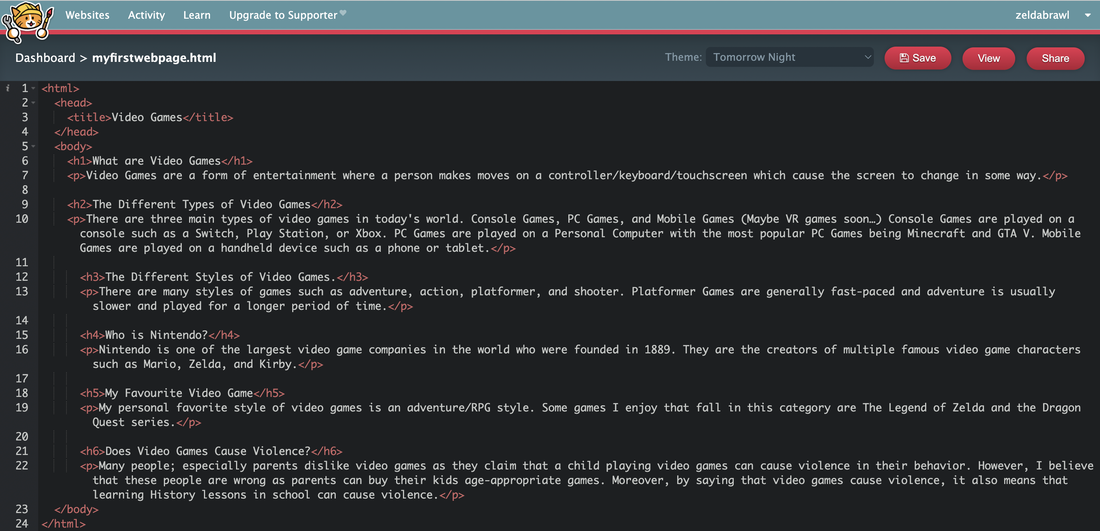 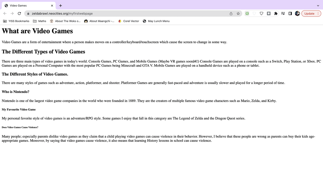 For this assignment, we were asked to create 3 logos with 3 variations of each logo. The most frustrating thing about this process for me was having ideas for logos as well as drawing them on Corel Vector after sketching it on paper. My favorite thing was seeing the result after I finished. So much hard work was put into this project and I felt satisfied to see the end result with all the logos. After making these logos, I learned that Graphic Design is really challenging and now I look at Graphic Designers differently as now I realize how hard it actually is. 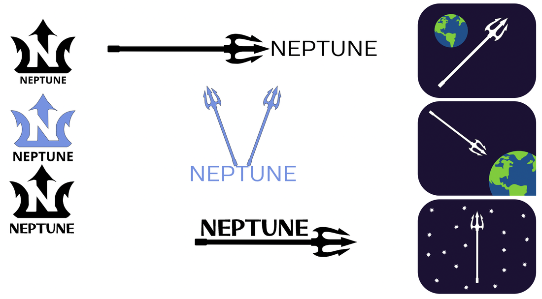 My brand Neptune is a light-weight temperature preserving water bottle brand. I decided to create a logo for my brand in order for customers to be easily able to recognize Neptune's products on the shelf and know that they were buying the best preserving water bottle in the whole world. The logo is in a shape of a trident which symbolizes water. The N in the middle stands for Neptune which is the name of my brand. I chose this logo out of the 9 as it looked the most professional and polished/refined. 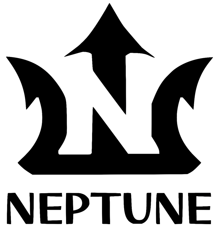 I decided to make a logo for a reusable water bottle company; similar to the popular brand Hydroflask. The three logos I chose was all included a trident of some sort with the company name Neptune. The first two the trident represents that it is used for water. The last logo with the trident being in space represents the water bottle being out of this world and also heading for the actual planet Neptune. The most frustrating part of this process was thinking of creative logos and designs without trying to repeat logos 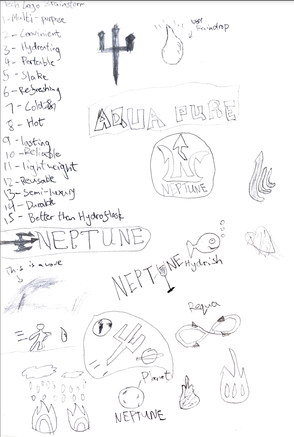 For the Color Names Assignment we were instructed to make 15 different shapes and assign them each a unique color while also labeling its RGB value and Hex code. I chose to use hexagons as the hex code and hexagon both start with hex. For the color schemes assignment we were instructed to make four different schemes. I used the website Adobe Color to make four different color schemes, Analogous, Monochromatic, Triad, and Complementary. My favorite scheme was the analogous scheme as all the colors fit together really well, however I didn't like the Triadic scheme as it felt like the colors didn't have any harmony Color Names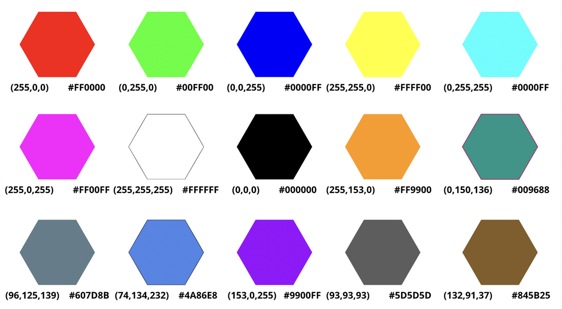 Color Schemes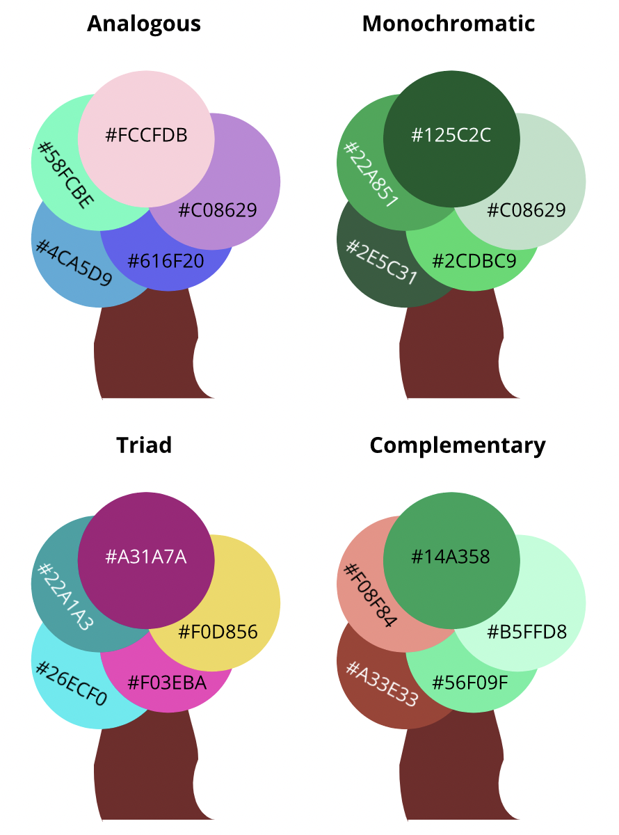 Typography is the art of writing or making letters in a different style that is legible. Typography is important, especially in graphic design as it is used to deliver the tone and mood of a piece. The quote "each font has a personality and a purpose," is linked to graphic design as based on the font you use you express a different emotion based on the style of the letters. There are 5 main types of fonts. Serif, Sans Serif, Monospaced, Script, and Display. Serif fonts have little feet that stick out from the letters and they are often used in print. Sans Serif fonts do not have little feet that stick out, so they look more premium. Sans Serif fonts are used on the web. Monospaced fonts are where each letter takes up the same amount of space, which makes it not ideal for large amounts of text. Monospaced fonts are used in coding. Script or Handwritten fonts are fonts that are made by hand. Similar to monospaced fonts it is not good for a large amount of text as it might be difficult to read. Script fonts are generally used in company logos and large headlines. Display fonts are the most unique out of all the fonts. They are sparsely used due to their very aesthetic style and the popularity seems to come and go. Typeface ComparisonWe were told to write a phrase or sentence with different styles of fonts. I wrote the phrase "You belong here" 5 times with the 5 different styles of fonts with the name of the style and the name of the font. 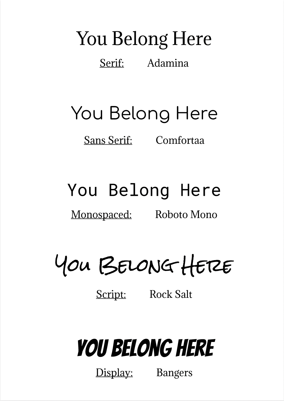 Word PortraitsIn this activity we used different fonts and based on how it looks tried to feel the mood. We wrote a word of phrase that matched the mood of the font and then wrote one word or phrase that didn't match the mood of the font. 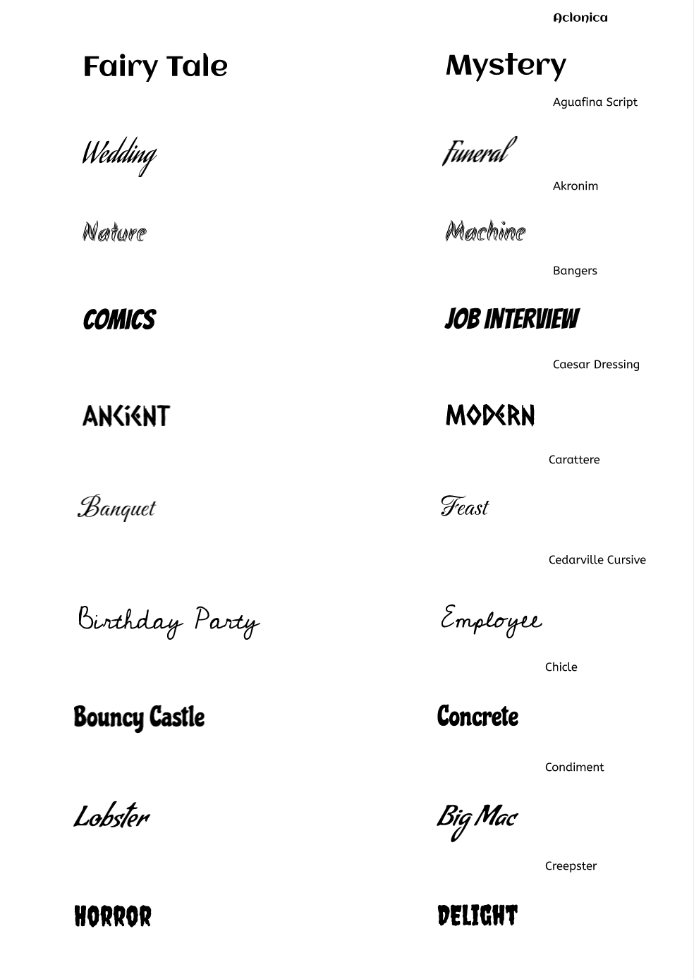 In this assignment I made a rocket ship out of shapes that were made with code. In this activity I learned how hard it was to code even the simplest things. When creating this simple drawing it took me twenty lines of codes just to make this rocket ship. Even making the angle right was hard for me. This made me think how hard it would be to code something complicated such as a car or even a phone. After making this I thought jobs in the field of computer science or coding would be very difficult and challenging to do. I used a website called Khan Academy and click here to try it out for yourself! 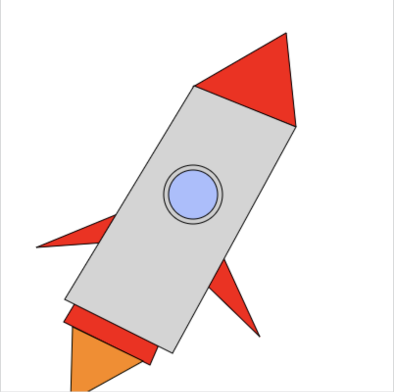 |
